
Design Concept
Feedback
In September 2021, the SEPTA Metro Wayfinding Master Plan recommendations were unveiled to the public on presentation boards in stations throughout the network.
A new interactive website further outlined the recommendations and featured a digital version of the proposed map, along with station renderings. Both the boards and the website encouraged the public to provide input on the recommendations, with 30,000+ website views in the first 24 hours. Over two months, riders contributed in-person feedback at 13 in-person “pop-up” events at the presentation boards, with questions and feedback recorded by 25 employee volunteers. When the boards were not staffed, riders contributed feedback 24-hours-a-day through a designated toll-free number in the form of text messages and voicemails. The concepts, renderings, and naming (“nomenclature”) generated a lot of excitement and thoughtful conversation. We were glad to get feedback from so many sources — both online and in the real world. Overall, viewers rated the renderings and concepts a 4.3 out of 5 across all stations.

The SEPTA Metro concept recommendations were developed over an 18-month period with significant rider and stakeholder involvement. The launch of these concepts allowed us to see what we got right, and what could be improved. This page provides a summary of the feedback we received and identifies our next steps based on that feedback.
| Key Takeaways | What We’re Doing About it |
|---|---|
| A lot of people thought we were renaming SEPTA! Luckily, we are not. | Moving forward, we will make it absolutely clear that we are not renaming SEPTA. “SEPTA Metro” doesn’t replace SEPTA any more than the name “SEPTA Regional Rail” does. |
| The nomenclature simplification (names, shapes, letters, and colors) are easy, clear, and accessible, but there were a few common points of confusion that we should address. | There are changes we can make to our recommendations to make them even simpler – for example, changing “Lines” to “Line” when there’s only one service, or improving the way we talk about infrequent services like the Sports Express. |
| Digital wayfinding tools, like the SEPTA website, app, or digital screens within the system, must be considered alongside the physical signage. | Point taken – we are redesigning our website, app, and other digital interfaces to be more modern, easier to use, and transit-first. |
| It is overdue to have real-time transit arrival information on the SEPTA Metro network through countdown clocks, platform displays, and mobile apps. | We are prioritizing the implementation of real-time arrival information on all SEPTA Metro lines and improving how it is communicated throughout the network – bus and Regional Rail included. |
| The Center City Pedestrian Concourse has always been a particularly difficult place to navigate and a comprehensive solution is needed. | We are looking into ways that wayfinding improvements in the Concourse can be expedited. |
| Simple tools like neighborhood/station area maps, more bus transfer signage, or exit numbering would go a long way. | We’re including all of these tools in the new wayfinding system. |
| We should broaden our scope to the bus and Regional Rail networks as well – all SEPTA services should be as integrated as possible. | We’re working with Bus Revolution and Reimagining Regional Rail to make sure our network is seamlessly integrated no matter where you are. |
Public Insight – By Line and Topic
 L Line
Currently the
Market-Frankford Line
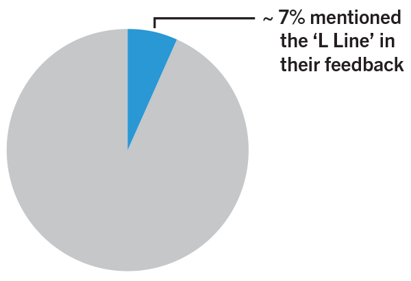
Feedback around the letter “L” mimicking the nickname “El” was mostly positive, with many people saying they use this term already. Keeping blue as the designated color was also appreciated, as it is well known already.
Most of the confusion was about the use of “Lines” when there is only a single service. As a result, we’ve changed our naming recommendation to “Line” across the Metro network, no matter how many service patterns each line has.
Our Action Items:
- Change “Lines” to “Line” throughout
- Prioritize roll out of real-time information on platforms and digital apps
- Address Route L bus naming through Bus Revolution
Quotes Representing Major Comment Themes:
“Using L for the El is obvious but appreciated. Everything about this just makes a lot of sense.”
“The L1 implies the existence of an L2. Just call it the L.”
“Everyone calls it the “L” anyways.“
“The Blue color is clear and bright.”
 B Line
Currently the Broad Street Line
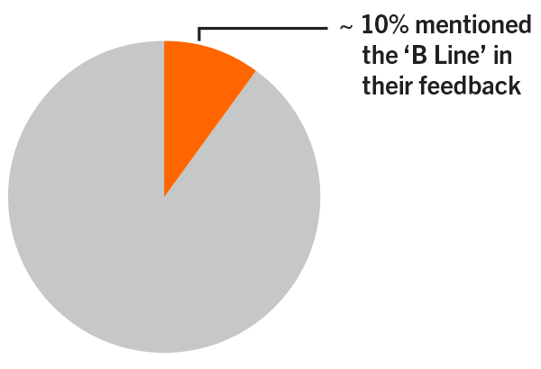
People appreciated using “B” and the color orange for the Broad Street Line, which would be easy for both new and long-time users. The use of a hollow square for infrequent service – like the Sports Express – caused some confusion. We received a few very thoughtful suggestions about other naming conventions, like B + X for express, or using a different color for the Spur.
To address this confusion, the revised recommendation is to refer to the Sports Express, as well as the typical Express, simply as the “B2 Broad Street Express.” Trains would be differentiated only by their end destination – Walnut-Locust or NRG – since they each make the same stops along the way.
In terms of usability, we heard that the most difficulty comes from making connections (especially to the trolley and bus), trying to figure out what track your train is on, and the general lack of real-time train arrival information.
Our Action Items:
- Simplify Sports Express symbol and naming
- Pilot neighborhood area maps to provide additional information about transfers, surrounding destinations, and geographic context
- Prioritize roll out of real-time information on platforms and digital apps
Quotes Representing Major Comment Themes:
“Real time screens are desperately needed at [Walnut-Locust Station], especially when deciding if you should take the local vs. the express.”
“I hope this wayfinding improvement ties into the bus stops at Broad and Erie! There are so many buses starting at that intersection, with unclear signage [to guide you to] where you should wait for each one.”
“I don’t use the BSL regularly and I think these signs would help me! Please make sure you also clearly label the transfer from the BSL to the trolley — currently, it’s only labeled by the green stairs [at City Hall Station], no signs at all, and it’s VERY confusing if you don’t have anyone to guide you.”
“THIS IS SO MUCH BETTER. I was constantly getting on the spur by mistake before. My one thought: Should the “special B2 that runs to the stadium” be called something else? Like the B2S or something? How do I know if it’s the regular B2 or the B2 Sports Special? Why not call it the B4?”
“No one has ever gotten on the spur by mistake. Probably no one could even get on the spur if they tried.”
 T Line
Currently the Subway Surface Trolleys
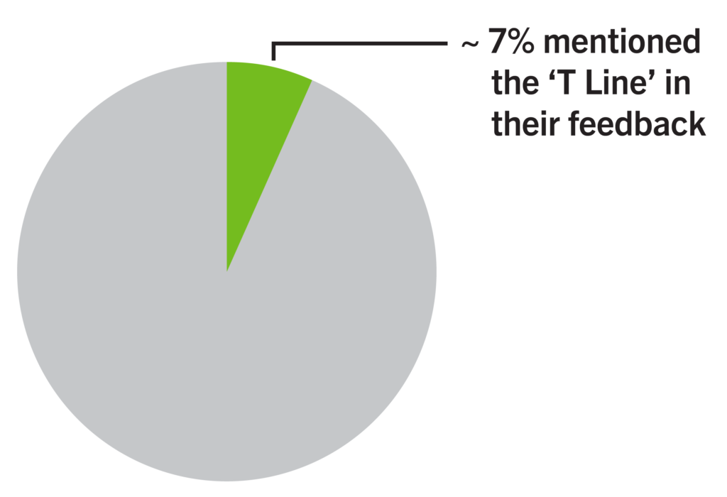
For the T Line, most comments were positive, and many people appreciated giving trolleys their rightful place alongside the Broad Street Line, Market-Frankford Line, and Norristown High Speed Line. People also appreciated the sequential numbering of T1 through T5, in geographic order.
Like comments for the Broad Street Line, most confusion was around using the hollow square symbol “T3” designation for the infrequent Chester Av service to Darby. Some recommended adding an additional service pattern for this extension, such as “T6.” We also received feedback that the proposed shade of green should provide more contrast against white for accessibility, so we’re revising this color to be bolder.
To simplify service pattern descriptions as much as possible, the T3 Chester Av will be differentiated by the end station – either Yeadon or Darby.
Our Action Items:
- Simplify T3 to Darby designation
- Revise green color for higher contrast against white
- Integrate improved wayfinding into new on-street station designs with Trolley Modernization
- Prioritize roll out of real-time information at stops, stations, and digital apps
Quotes Representing Major Comment Themes:
“40th St Portal needs internal wayfinding to direct departing riders to the T2 outbound or T3/T4/T5 outbound. And arriving riders need signs to point to Baltimore, Woodland, and University Ave; again a neighborhood map is crucial.”
“The sequential renumbering is one of the best parts of the rebrand. So much easier. Huge upgrade.”
“At last! And may I say it’s a major improvement over the current Trolley wayfinding signs. I’m glad to see all five trolley subway lines shown in their entirety. Also, great to see the five routes with Ts to distinguish them from the bus routes. Glad to finally see it. It’s been a long time coming!”
“The new map is great too. It gives far more information about the non-Regional Rail trains – especially the City trolley lines — than the current map does. SEPTA should have done this decades ago. It is a long time coming.”
“Love this idea. It unifies the light rail and subway options and makes it much easier to explain to those unfamiliar with the system. As a daily rider, I think it is well-thought out and look forward to seeing the implementation of these changes.”
 G Line
Currently the Route 15 Trolley
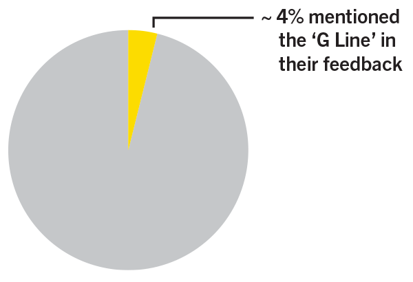
For the G Line, many people appreciated giving the current Route 15 its own color, while some expressed confusion.
Some comments expressed preference for the G Line being communicated as a “Trolley,” and therefore part of the T Line, given its use of the historic streetcars. However, since this line runs along a different corridor than the T Line, the recommendation remains to keep its designation unique.
Since there’s only one service pattern – the G1 – there was also confusion around the use of “Lines” instead of “Line.” The revised recommendation shortens the line name to “G Line.”
Further study is required to determine how the line’s current temporary operation (part bus / part light rail) affects communication and nomenclature both as the line operates now, and in future operations and planning.
Our Action Items:
- Revise “Lines” to “Line” throughout
- Integrate improved wayfinding into new on-street station designs with Trolley Modernization
- Address Route G bus naming through Bus Revolution
- Prioritize roll out of real-time information at stops, stations, and digital apps
Quotes Representing Major Comment Themes:
“Incredible work thus far! Blown away by the thoughtfulness and thoroughness. The only thing I find confusing with the new naming convention is the pluralization of the L and G lines.”
“I am bewildered by this new plan… There’s already a G bus, but now people will have to distinguish between the G bus and the G lines? This can’t be for real.”
“Since trolley modernization will eventually make trolley routes more Metro-like, consider adding the car stops on Girard Ave.”
 D Line
Currently the Media/Sharon Hill Lines (101/102)
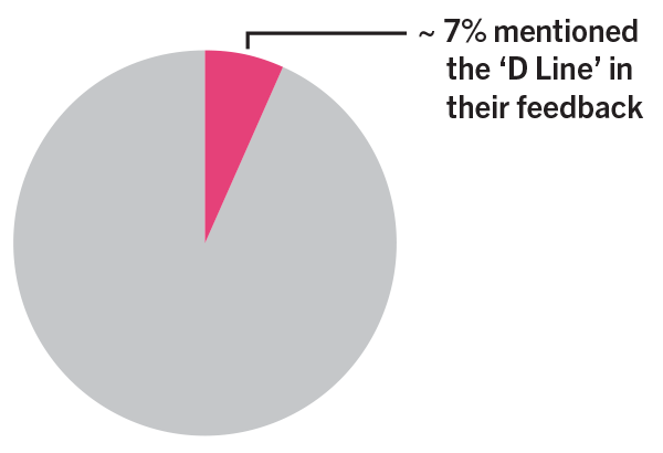
For the D Line, comments expressed excitement for the new, separate color, as well as the opportunity to promote this valuable line with the new look.
Confusion centered around the term “Delaware Lines,” and whether it referred to the County, the State, or possibly even the River. Like the M Line, we will rely more heavily on the letter abbreviations and use the long-form name as subtext. What is important for usability and accessibility is the letter and that we must stick to it consistently. Knowing exactly what it stands for can be a help to some, but for most it will be the “D Line.”
We also received feedback expressing confusion around the formal terminal station name “Orange St” for the end of the D1 service, as well as the current Direct Bus route, which is sometimes referred to as the Route “D” bus. We will conduct a formal review of all station names and make refinements to enhance clarity, in coordination with all necessary partners. Through Bus Revolution, we’ll ensure that there is no overlap in route designations.
Our Action Items:
- Use “D Line” as the primary name
- Rethink D1 end of line (“Orange St”) name
- Address potential for Direct Bus confusion
- Apply lessons learned for new station designs through Trolley Modernization
- Prioritize roll out of real-time information on platforms and digital apps
Quotes Representing Major Comment Themes:
“I think the D rebrand could really raise the profile of these routes. Love the color too. This is one of the biggest upgrades in the rebrand.”
“Should rename the 101 and 102 to Delaware County Lines since they do not enter the state of Delaware.”
“Great to see how this major transfer location looks. Love the M and D line naming. I think the D line branding will particularly bring these trolleys more prominence as they currently seem like the forgotten piece of SEPTA’s rail transit.
One note…would it make sense to add the bus route numbers to the white space on the Station Arrival sign?”
“You see that tall S Logo Sign at the entrance to the station, we need THAT at Lansdowne Ave and along the Delco Lines (I refuse to call it the Delaware Lines). ”
“Orange Street’ is not helpful as a destination. That destination sign should say ‘Media.’ If you need to include the actual name of the last stop, then change the name to ‘Media-Orange Street” or something similar. ”
 M Line
Currently the Norristown High Speed Line
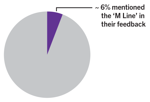
The changes for the M Line are bigger, due to this line’s lower level of awareness among regional residents, and its long and misleading name (“Norristown High Speed Line”) — so we were ready for the comments! Keeping the purple color was well received, but there were many comments about the name. For example, should it be Montgomery, Montgomery County, or MontCo? What about Main Line? We also heard that this line’s stop-request system has been confusing historically, and that it’s very easy to get on the wrong train or miss your station.
As a result, we are relying more heavily on the letter abbreviations and using the long-form name as subtext. What is important for usability and accessibility is the letter and that we must stick to it consistently. Knowing exactly what it stands for can be a help to some, but for most, it will be the “M Line.”
Our Action Items:
- Use “M Line” as the primary name
- Focus on simplifying operations, from service patterns to the stop-request system
- Maintain flexibility for future services to King of Prussia
- Apply lessons learned in new station designs on King of Prussia Rail extension
- Prioritize roll out of real-time information on platforms and digital apps
Quotes Representing Major Comment Themes:
“As a newer resident of Bryn Mawr, navigating the Norristown line has been confusing. This is a huge improvement.”
“As a newer resident of Bryn Mawr, navigating the Norristown line has been confusing. This is a huge improvement.”
“M seems like it leaves out the fact that it also serves Delaware County as well.”
“[Part of the problem is] not always the lack of information, but too much fragmented information and fragmented branding/coloring scattered across all surfaces (lack of consistency). For example, in one NHSL station the “to buses” sign may be a big overhang over the doorway; in the next station it may be a vertical one on a post to the side; so, no mental map of the system ever emerges where riders can learn to look for info in the same spot in every station.”
“I absolutely love the “Metro” with colors and letters re-brand of system. This is most helpful on the NHSL which is pretty confusing for people. The line doesn’t just serve Norristown.”
“I like that it [gets ready for the] KOP extension.”
“Love the M/MontCo rebrand. MUCH better than current name.”
“Montgomery lines isn’t super descriptive and I feel like folks don’t have a firm sense of when counties start and end …Is there another term? Maybe W for western? ”
 Nomenclature
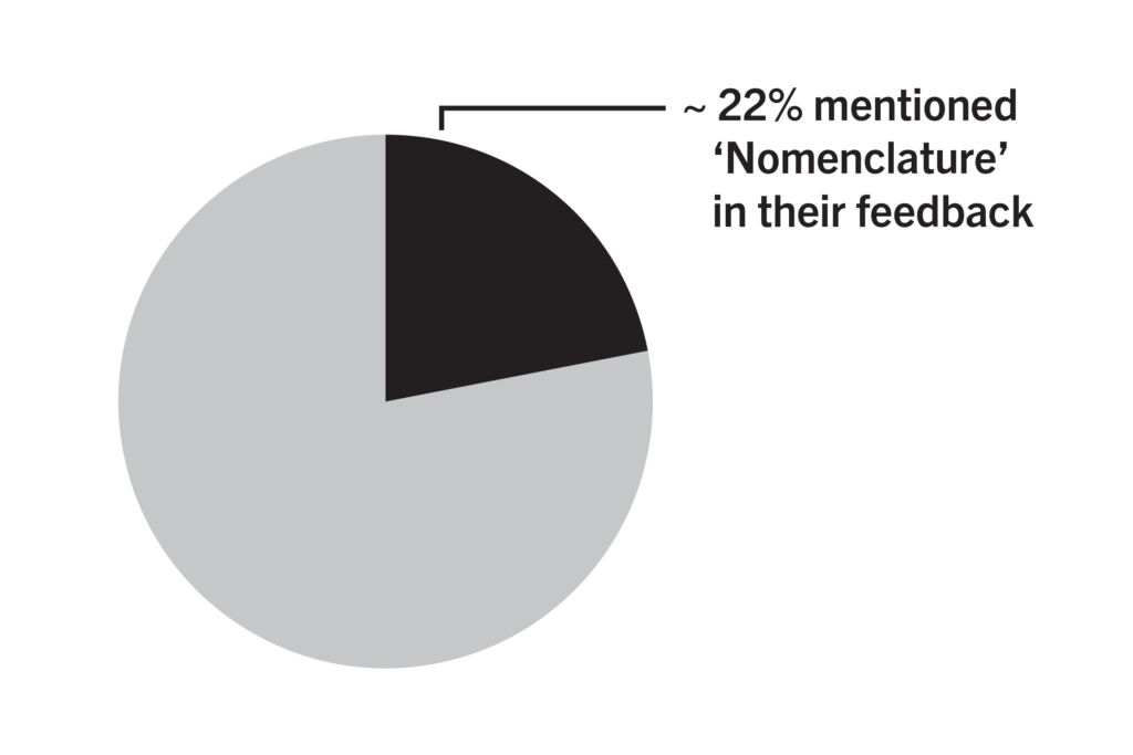
Almost one quarter of people weighed in on nomenclature, such as names of lines to descriptions of services and station names.
The feedback was largely positive. The most significant change made is simplifying each line name to designate each line’s letter – such as the L for L Line – as the official name.
We’ll still use a long-form name as subtext. What is important for usability and accessibility is the letter and that we must stick to it consistently.
Our Action Items:
- Focus on the letters as the primary line identifiers, not long English names.
- Use the singular word Line to describe each letter, and each number is a service.
- Eliminate proposed use of hollow square for infrequent service, like the Sports Express or T3 to Darby.
Quotes Representing Major Comment Themes:
“The new wayfinding signs for 69th Street are clean and concise, although I am unsure about the use of ‘D’ and ‘M’ terminology for the suburban trolleys and NHSL.”
“is the long name even necessary? Since locals will know the allusions/meaning behind L, B, G, etc. but visitors are more likely to [automatically] follow the colors/letters (“I need to take B-Fern Rock to get to Olney”), maybe the long names aren’t even necessary on signs.”
“This is so beautiful! Except: Why does it say “Market-Frankford LineS” when there’s only one of them?”
“[The new line names are] going to be even more complicated… The only change that is needed is to improve the signage throughout the system. The maps could use updating too.”
“Integrate PATCO as a P line! Love the wayfinding changes but fare standardization and free transfers will do more.”
 Signage
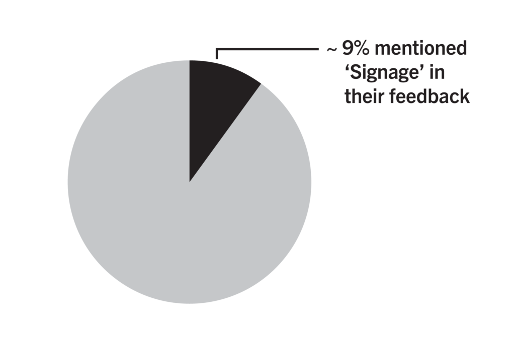
Comments on signage were largely positive, and most people expressed appreciation for the concepts and possible signage locations.
Constructive criticism tended to relate to existing wayfinding conditions. We hope that new signage and communications tools alleviate these concerns.
Our Action Items:
- Improve transfer connection signage
- Address wayfinding in the concourse as soon as possible
- Develop neighborhood/station area maps and exit numbering systems
- Continue to coordinate with PATCO
Quotes Representing Major Comment Themes:
“I HAVE BEEN WAITING FOR THIS FOR OVER A DECADE THANK YOUUUUUUU!
Also please don’t forget to update directional signage for transfers, especially at City Hall and in other parts of the concourse. Maybe colored lines on the floor to help you know where to walk to get to another line?”
“Having [line map signage] on each side [of the platform] for the local/express stops is amazing. I’ve had to explain to out-of-towners which ones stop where a few times; this should help a lot.”
“[Declutter] hallways and safety/notice signs, otherwise new wayfinding will still get buried among those. Safety and notice signs should… in designated [and predictable locations]… so things as mundane as “no smoking” and service change printouts are no longer taped up at random all over the place, but neatly arrayed in limited areas.”
“Love the bus transfer signage! Bus transfers need to be included in wayfinding signs in the unpaid area for all stations.”
“As a Philly newcomer, this wayfinding is so needed! I am so excited about this. One suggestion I would make is to add signage to the exits closest to the exterior – I often have no idea which stair would take me to which street or direction. This is huge inconsistency in that exit signage.”
“Love love love love the improvements. Feedback: integrate PATCO as seamlessly as possible; countdown clocks viewable outside of stations.”
“Leave Septa as it is, I have never had a problem figuring out this system, nor have many other longtime passengers. If the younger generation is not smart enough to figure it out, they don’t need to ride it… Also, leave the EL as the EL, Chicago has the L, Philly has the EL. ”
“Unknown as to why SEPTA believes it should pay millions to change signage because people are not paying attention, noses in their phones. The system is quite simple as is. ”
“One thing that the CTA does well is indicate where the ADA-accessible elevators are from the moment you step in the station or off the train. This includes adding elevator arrows in the running platform signs. The Night Owl service sign was not changed in the renderings, but there should be directional arrows to point riders where to wait for the Night Owl bus when the station is already closed. ”
 Color
Color
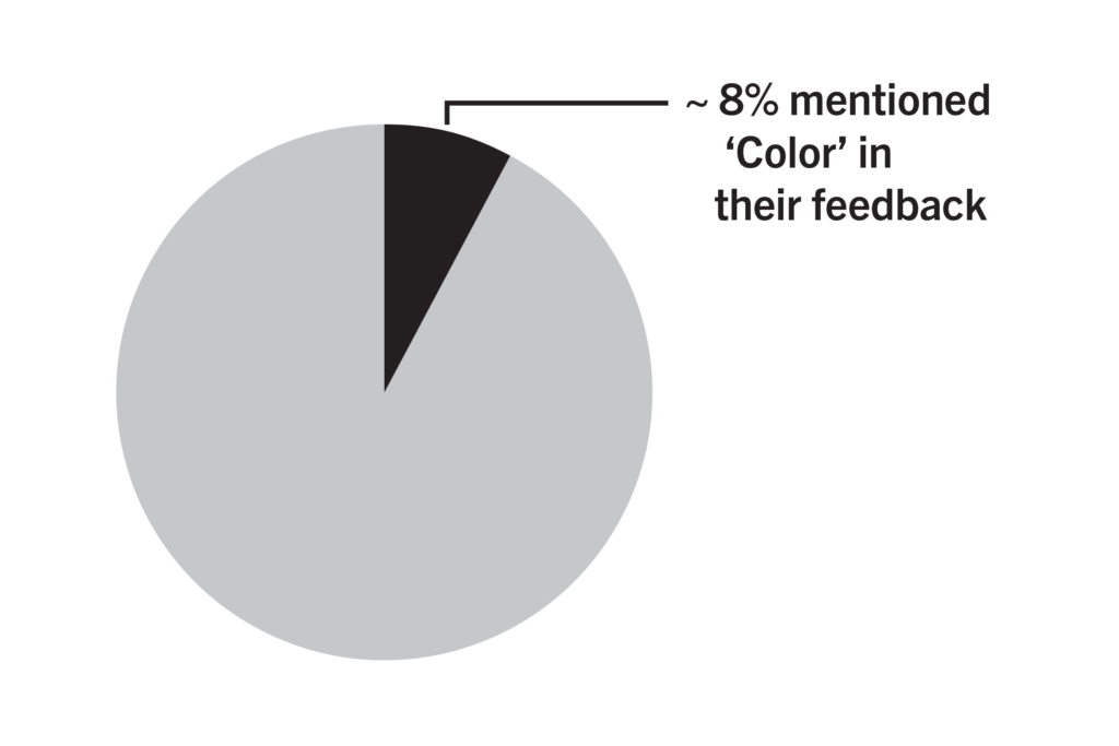
Many comments expressed excitement around the refreshed color designations in the concept renderings.
Further study will ensure that final colors balance contrast, visibility, legibility, and accessibility. This will include compatibility with small and large signage, websites and apps, and digital screens.
Our Action Items:
- Revise the proposed green color to provide greater contrast against white.
Quotes Representing Major Comment Themes:
“I love that the D lines will be pink! Can we paint the trolleys pink too? It would be so much fun!”
“I love that the D lines will be pink! Can we paint the trolleys pink too? It would be so much fun!”
“Use route badge fills consistently across materials. For example, if among the B Lines the B2 is hollow to indicate limited/special service, don’t use hollow badges for other routes – like the L1 in this example – to blur the distinction.”
“Nice job! And the bright colors make things that much more inviting!”
“Has anyone tested these colors for color blind people? Some colors seem to have the same greyscale value.”
 Map
Map
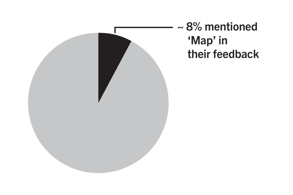
Most people appreciated the additional maps and travel tools presented in the concepts.
Several comments mentioned considering additional connectivity on the map, such as adding additional Regional Rail stops and connections to other non-SEPTA rail services, as well as additional neighborhood and destination names.
These suggestions will be considered as we refine map types in the forthcoming Wayfinding Manual.
Our Action Items:
- Ensure that the map is legible even at small sizes
- Consider additional connectivity to Regional Rail
- Consider adding other services, such as connecting NJ Transit service
Quotes Representing Major Comment Themes:
“Breaking all the lines down into their service patterns and showing them individually works really, really well and is very intuitive.”
“My only issue is regarding Regional Rail. I understand that it is not currently… a high-frequency rail. But I still think a visitor should see all the stops on the RR depicted — at least in the city and inner ring suburbs. For example, on this map, it is unclear how to travel to Manayunk or downtown Germantown.”
“Buses that run more frequently than rail services are nonetheless still shown thinner and less important. Why? ”
“Finally!!! Can’t wait for new maps! ”
“Wow, this is excellent. I’ve lived in Philly for 3 years and SEPTA is still hard to use, but this map is very helpful. The stations need to be easier to navigate. Trying to find platforms in the underground stations can be very difficult when transferring between lines. ”
“Consider adding… points of interest to the map: Temple Univ near Cecil B Moore… Eastern State, major hospitals, theaters, midsize parks like Hunting Park, etc. ”
 Network Identity
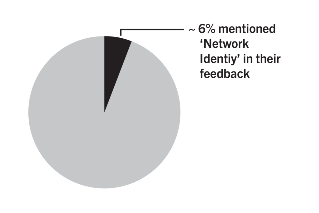
For Network Identity, comments were generally positive as we move forward with the universal term “Metro” to describe the Rail Transit network.
Most negative comments about the term Metro was confusion about whether “Metro” applies only to Rail Transit or to SEPTA as a whole. We’re being more careful in our communication that “Metro” is not replacing SEPTA any more than the term “Regional Rail” does. We also received a lot of great suggestions for typefaces.
Our Action Items:
- Make it absolutely clear that no one is renaming SEPTA.
- Use the term “SEPTA Metro” where possible, just like “SEPTA Regional Rail” or “SEPTA Bus.”
- Conduct typeface study to evaluate other common signage typefaces against Roboto before making a final decision.
Quotes Representing Major Comment Themes:
“Beautiful, clean, and easy to read!”
“Love these, would be even better if you brought back the R system for regional rail!!”
“Consider reducing amount of text even further by making the line badges do more of the work. Abroad and increasingly in airports, non-place-name text on signs is eliminated in favor of pictograms… Even words like “bus” “to” “pedestrian concourse” “exit” might not be needed in favor of pictograms.”
“This is such an improvement. It should make things much, much easier for tourists and occasional users of the system (who will, I hope, become more frequent users of the system once they realize it’s much easier to use).”
“I absolutely love the “Metro” with colors and letters re-brand of system.”
“Call the system Eagle slogan can be Phly, Philly, Phly.”
“Keep SEPTA! The local flavor of the word has more staying power than the generic “Metro.”
“Major cities across the world implemented simple colors, line info, and naming conventions. Happy to see SEPTA finally catching up.”
“I dislike the term metro because DC already has one and there will be negative comparisons. Can we call it Trax or FastLink.”
 Bigger Picture
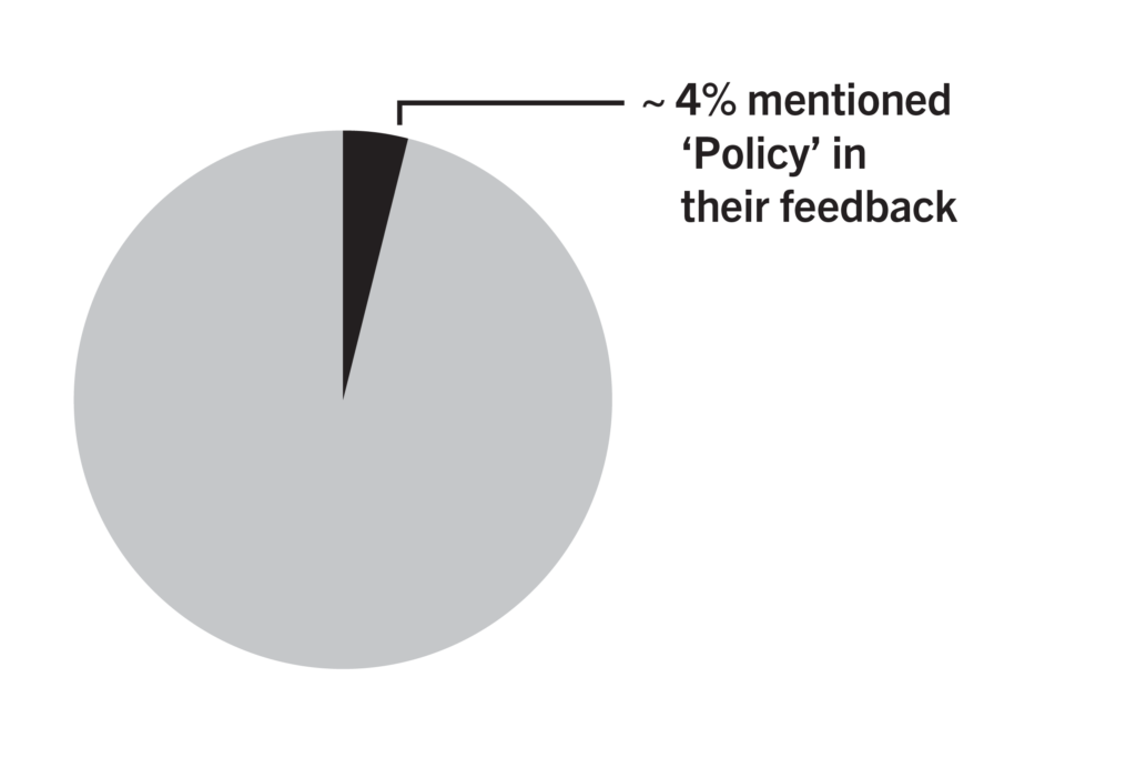
Some comments were related to topics that would require policy review and change. Official station naming, service frequency, and other customer experience feedback for Metro planning was shared.
These issues are closely related to wayfinding, and many should be addressed. For example, signage is only going to help so much if our service is too complicated to use, or if we have three stations with the exact same name.
Some stations, like those on the L Line or B Line, have lots of amenities, while some, like on the T Line, are just a sign, often with no place to sit. While new signs are great, a journey often begins with the SEPTA website, or an app, neither of which are meeting the needs of today’s riders. Finally, real-time arrival information is not yet available for the SEPTA Metro network.
These were some of the issues brought to our attention, and here’s what we’re going to do about it:
Our Action Items:
- Integrate Trolley Modernization and other ongoing capital projects to ensure the future of this network is as great as it can be – through “Project Metro”
- Redesign the SEPTA website and app
- Develop new station design standards for trolley lines
- Prioritize real-time information for every SEPTA Metro line, both on platforms and through any app of your choice
- Look for opportunities to simplify service, improve frequency, and provide more consistency
- Address duplicative or confusing station names
Quotes Representing Major Comment Themes:
“There should be a [real-time] sign at every subway stop and every …bus stop that informs riders when the next 2 trains will be arriving… At stations like City Hall, it should include [buses as well] for people who need to connect to buses as they leave.”
“This is really awesome!! I am sure a ton of people are complaining but I wanted to throw in some positivity. Now do the same thing with regional rail and improve service while you’re at it:)”
“[At 69th Street], “Market-Frankford Lines” is less prominent than “No Loitering.” Which is itself an amusing assertion given that the whole point of a station is to loiter.”
“please please please do this! Better map, better nomenclature. Incorporate the PATCO like make the P line, better and make part of the same fare. Bring back R-numbers!!!”
“What these before/after renderings demonstrate clearly is that SEPTA STATIONS NEED TO BE MORE BRIGHTLY LIT.
On every image, the “after” rendering has bumped up the brightness of the underlying image by 10-20%. That should tell you something! More lights underground!”
“My main issue with the High Speed/M Line is that the trains don’t automatically stop at every station and say what station they are at creating confusion for new residents and visitors. That is the reason I won’t use the train service.”
“Do it for all stations, not just big ones.”